Theme and design tokens
Every colour on the site comes from one theme, defined in src/theme/tokens.ts:
- Seven base colours, each in a family:
brand,ink,highlight,signal,surface,successanderror. - Each becomes a scale from 50 (lightest) to 900 (darkest), with 500 the base colour:
brand-50…brand-900. - Two tints,
tint-20andtint-50: very light single colours for quiet backgrounds.
The family names are semantic, never brand names, and are chosen not to clash with Tailwind's own palettes or the UI component roles.
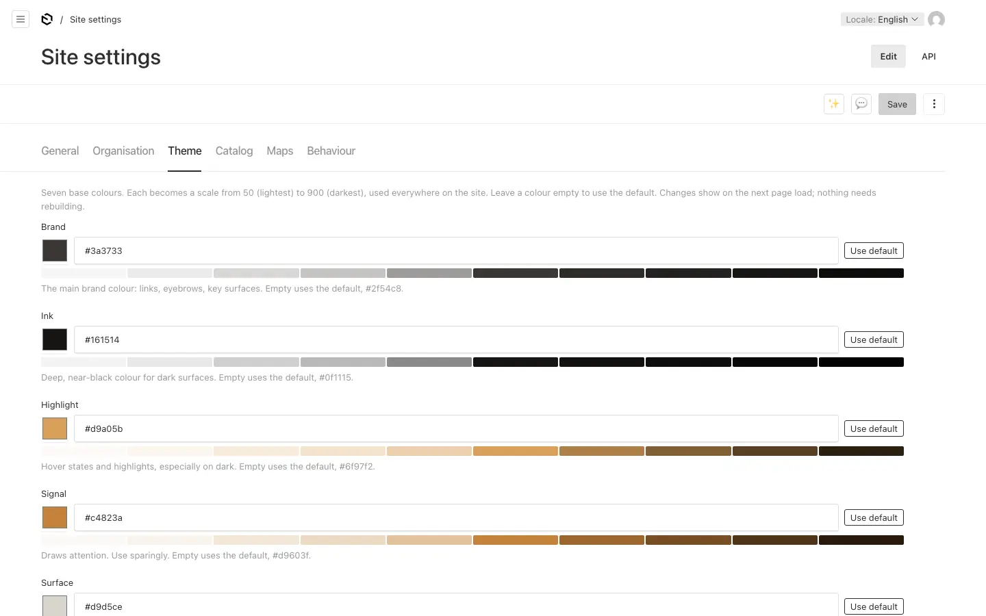
Changing the colours #
- Editors (admins) set the seven base colours and the two tints in Site settings → Theme. The change shows on the next page load: the site writes the changed colours as CSS variables in the page, and nothing is rebuilt.
- Developers set the defaults in
src/theme/tokens.ts(DEFAULT_THEME), then runpnpm generate:theme. See Theme colours. - Only what an admin set is stored. A Theme field left empty shows the default in grey and follows it, so a new default in
DEFAULT_THEMEreaches running sites too, except for the colours their admins chose.
How it works #
- Every step is a CSS variable,
--color-brand-500, and the Tailwind utilities read the variables:bg-brand-500,text-brand-500/60. That is why the theme can change at runtime. - Editors pick tokens, not colours. A block's background stores
brand-500, so it stays valid when the theme changes. - Text stays readable on any background. For every colour the theme also makes
text-on-<token>(black or white, whichever has more contrast) andtext-on-<token>-accent(the eyebrow and link colour: a brand step where it reaches a contrast of 4.5:1, else black or white). Blocks take their text colours from these, never from fixed white or black. A test checks the contrast. - Text on images sits on a dark band (
TextScrim), so it passes WCAG AA on any picture: in the hero, on cards, and in any block with a background image. - Classes built at runtime (
bg-${token}) are listed in the generatedsrc/theme/theme.css, so Tailwind keeps them.
Scroll animations #
Site settings → Behaviour → Scroll animations picks how sections come into view: fade (the default), premium or none. SiteShell puts the choice on <main> as data-scroll-animation, and the CSS in src/app/(frontend)/globals.css ("Reveal on scroll" and "Premium motion") does the rest. Blocks only mark what moves:
| Attribute | On | Fade | Premium |
|---|---|---|---|
data-reveal | an element | fades up 16px | rises 48px on a longer, softer curve |
data-reveal-stagger, data-reveal-child | a list and its items | one after another | the same, further apart |
data-section-header, data-headline, data-line | set by SectionHeader and HeadingRichText | the header's parts fade up | the headline rises line by line from behind a clip edge, over the header's own entry |
data-reveal-media | a picture's frame (it clips, usually overflow-hidden) | nothing | opens from a rounded inset while the image inside settles from 1.12 to 1 |
data-reveal-track | a row that scrolls sideways | nothing | the pictures in it follow the row's entry |
data-parallax | an opening picture's layer (the full hero, a product's opening) | nothing | the picture drifts slower than the page as it scrolls past |
RenderBlocks marks a page's first block data-opening (pass opening, as PageArticle does), and products and families mark their opening picture: premium plays it as the page loads, since it is in view from the start. Card pictures (data-teaser) zoom a little on hover with premium.
The rules every animation keeps, so content can never be left hidden:
- CSS only. A hidden state lives only in keyframes, so an animation that does not run leaves the element as it is. Transforms and clip paths never move the layout.
- Two layers. Where the browser can tie animations to scrolling (
animation-timeline: view()), they follow the scroll. Elsewhere they play once as the page loads, and always end visible. - Every scroll range ends by
entry 100%, when the element is fully in view. An element at the very end of the page gets there once the page is scrolled to the bottom, and one inside a box that clips but never scrolls (overflow: hiddenmakes that box its scroller) counts as fully in view of it. A later end could leave either half hidden; useoverflow-cliprather thanoverflow-hiddenon a box whose contents animate. - A named timeline only where its declaration is certain: an animation whose timeline name is missing stays on its first keyframe.
- Less motion means none.
prefers-reduced-motion: reduceandnoneswitch everything off from the first frame.
A block that animates with JavaScript asks useAnimateOnScroll() (src/providers/ScrollAnimation.tsx), true for fade and premium, and checks usePrefersReducedMotion() as well.
Fonts #
The site uses Geist Sans and Geist Mono (the geist package, OFL), set on <html> in src/app/(frontend)/[locale]/layout.tsx and mapped to --font-sans and --font-mono in src/app/(frontend)/globals.css. Change them there.
The style guide page #
/styleguide on the site shows every colour, type size and UI component with the current theme. Use it to check a theme change.