Sections and reusable sections
Every block on a page is a section of it, and most blocks share the same tabs, so a setting is in the same place on every block.
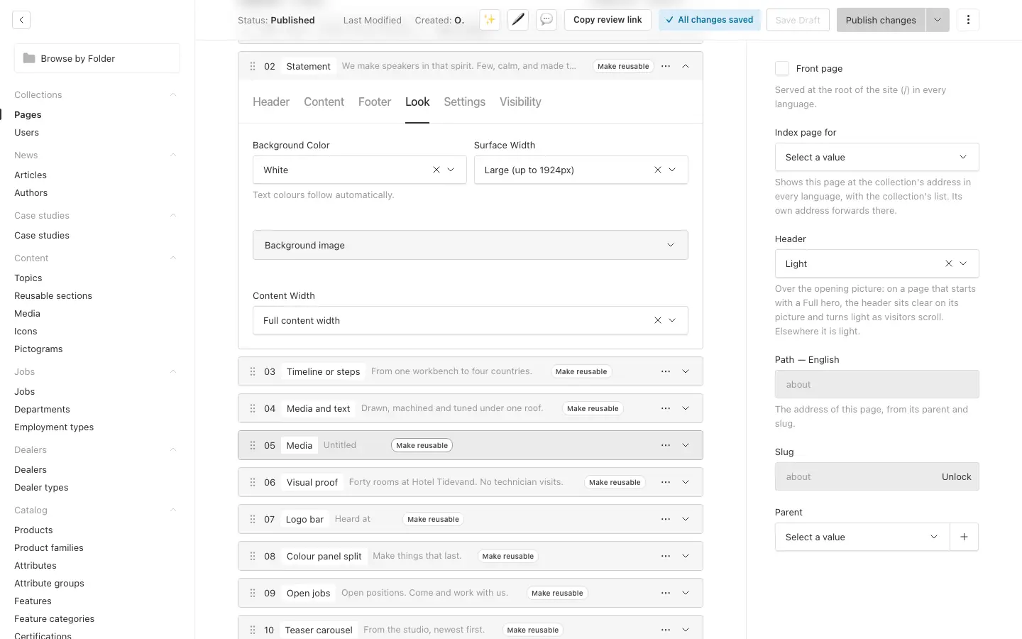
The tabs of a block #
Header. An Eyebrow (a short label above the headline), the Heading and a short Body. To dim part of the heading for a two-tone look, select it and pick an opacity in the toolbar: the heading stays one phrase for translation. Typography sets the headline's size and its heading level separately. The level (H1 to H4) is for search engines and the page's outline; the size is how big it looks. Keep one H1 per page: the hero's heading is H1, other blocks start at H2.
Content. The block's own material: cards, pictures, rows.
Footer. Up to three buttons or links below the block, aligned left, centre or right.
Look.
- Background colour: a colour from the theme. Text colours follow by themselves, so text stays readable.
- Surface width: Large stops at a very wide maximum; Full width runs edge to edge.
- Background image. The block's content sits on a dark band over it, so text reads on any picture, a white one included; the picture shows in full above and below. An overlay (subtle or strong) darkens the whole picture as well.
- Content width: narrows the content, down to a comfortable reading width.
Settings.
- Anchor: an id for links within the page. A block with the anchor
featuresis where a link to#featuresscrolls. - Space top and Space bottom: from None to XL. None lets two blocks of the same colour run together.
- Min height: a minimum height, up to the full screen.
Visibility. Show the block in every language, only in some, or in all but some; and hide it at chosen screen sizes, such as on phones. A row with these settings shows badges: one per language, crossed out where the block is hidden, and the screen sizes it is hidden at.
The hero #
The Hero block opens a page and keeps its settings together, without tabs. Pick its type:
- Full: the picture fills the background and the text sits on it. Choose where the text sits, an overlay, and how tall the hero is. A Film plays over the picture: a short, silent loop, like a moving photograph. The picture shows until it plays and stays for visitors who ask their system for less motion; a round button in the corner pauses and plays it. Use an MP4 of a few seconds and a few megabytes, starting on the picture itself. Text on the picture is white on a dark band (the default, for any picture) or black on a light band, for a light picture with a calm, light area where the text sits, such as a product on a pale background. On a light picture the band is barely there; it keeps black text readable where it crosses the product.
- Standard: text with a picture, stacked or side by side.
- Minimal: text only.
- Slider: a full hero for each page it features, picked by hand or the newest. Each slide shows the page's card with a link to it and moves on by itself; visitors can pause it.
A hero has up to two buttons and its own background colour. It has no Visibility tab: it shows in every language and on every screen.
Reusable sections #
A reusable section is a set of blocks you build once and show on many pages: a call to action, a contact strip, a row of logos. Change it in one place, and every page that shows it changes too.
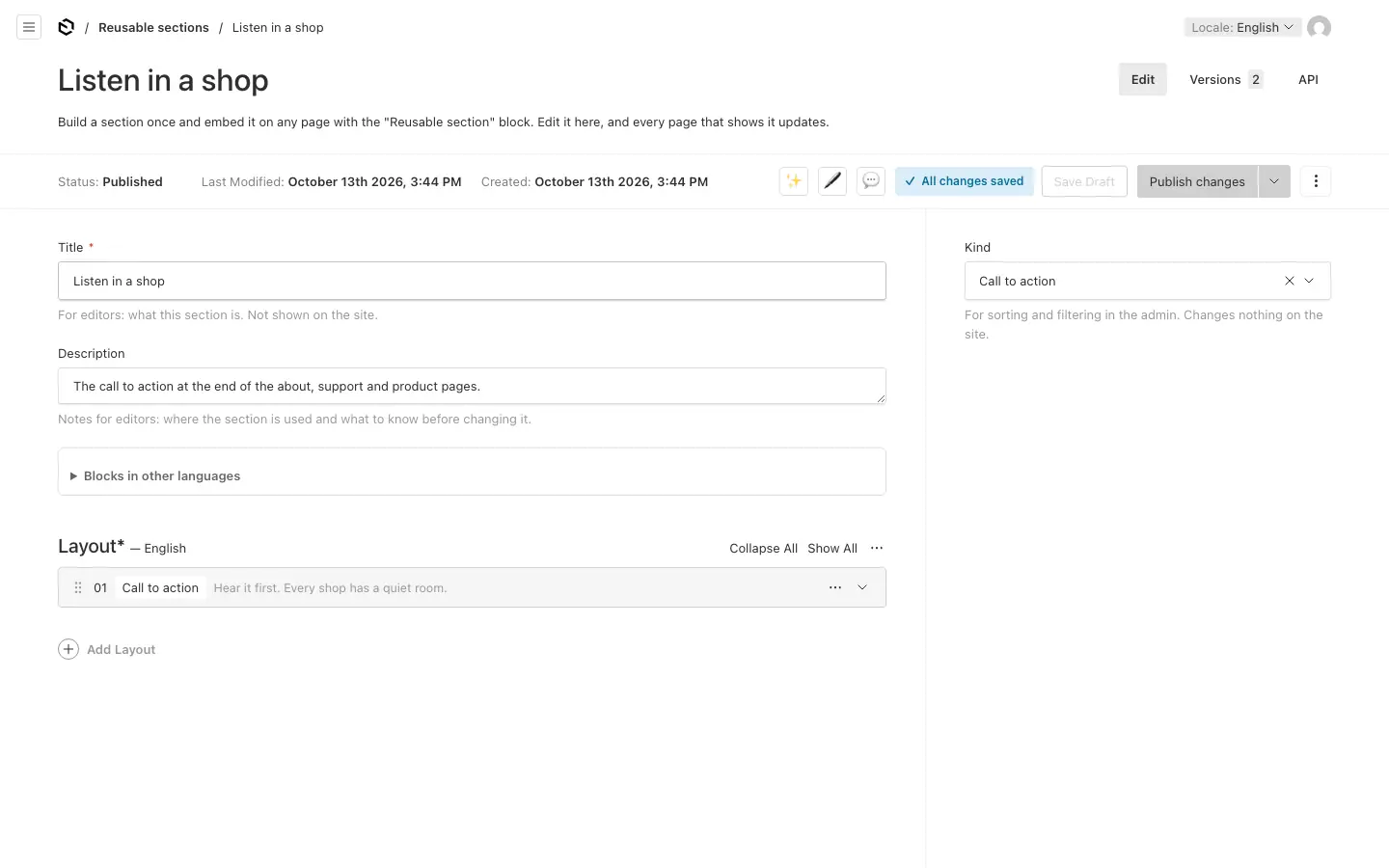
Create one #
- Open Content → Reusable sections and press Create New.
- Give it a Title and, if you like, a Kind and a Description. They are for editors and never show on the site. Note in the description where the section is used and what to check before changing it.
- Add blocks as you would on a page. A section cannot hold another reusable section.
- Press Publish changes. Pages only show published sections.
Already built the blocks on a page? Press Make reusable in a block's row. After you confirm, the block becomes a new section, published at once, and a Reusable section block takes its place on the page. Save the page to keep the swap. It works in the default language.
Show it on a page #
Add the Reusable section block and pick the section. The block has its own anchor and Visibility tab, so a page can hide the section in some languages or on phones.
Change it #
Open it under Reusable sections, edit and publish. Every page that shows it is updated.
Like a page, a section has its own blocks in each language, and its own translation status.