Pages and blocks
A page is a stack of blocks: a hero, text, pictures, cards, a form. You build it from top to bottom, and every block looks right on every screen and in every colour of the theme without design work.
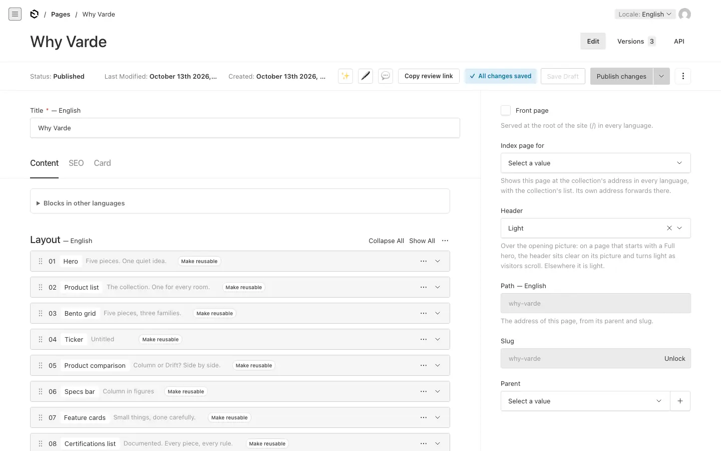
Create a page #
- Under Pages, press Create New.
- Give it a Title. When the page is first saved, its slug (the last part of its address) is made from the title.
- To place it under another page, pick a Parent in the sidebar. A page with the slug
teamunderaboutlives at/about/team.
The sidebar also holds:
- Front page: shows this page at the root of the site (
/) in every language. Only one page can be the front page. - Index page for: makes this page the start page of a collection, such as News or Products. It is shown at the collection's address with the collection's list, and its own address forwards there. One per collection.
- Header: Light, Dark, or Over the opening picture: on a page that starts with a Full hero, the header sits clear on its picture, with white text on a soft dark band, and turns light as soon as visitors scroll. On a page that starts any other way it is light.
- Path and Slug: the address. The slug is locked: press Unlock to edit it, or Generate to make it again from the title.
A new slug or parent moves a published page. Its old address keeps working: visitors are sent on with a permanent redirect, which you can see under Settings → Redirects. Publishing is refused at an address the site uses itself, such as a language prefix.
Add blocks #
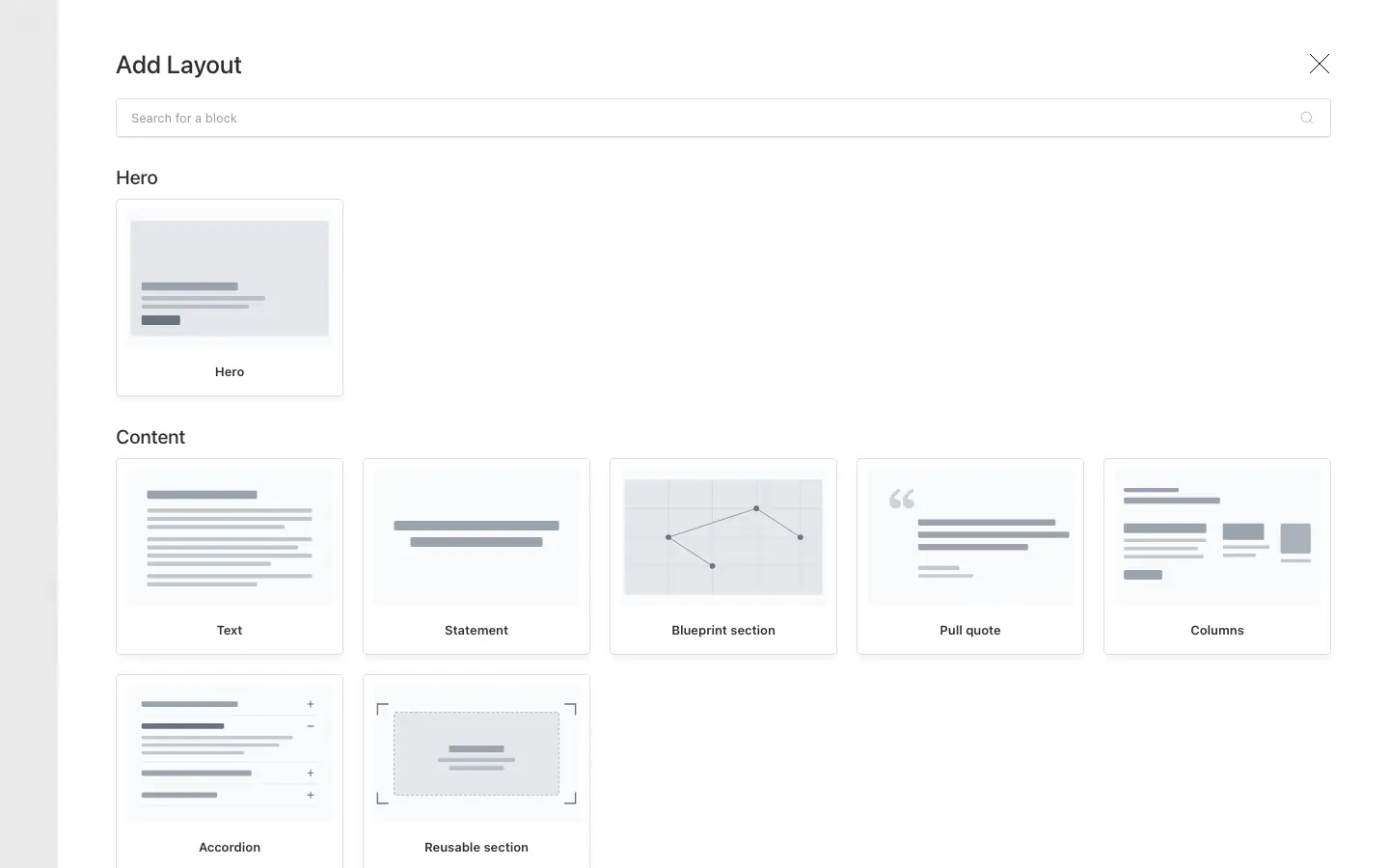
In the Content tab, press Add Layout. The blocks are grouped by kind, each with a picture, and you can search them.
| Group | Blocks |
|---|---|
| Hero | Hero |
| Content | Text, Statement, Blueprint section, Pull quote, Columns, Accordion, Reusable section |
| Media | Media and text, Media, Media carousel, Video player, Scroll reveal gallery, Before and after, Timeline or steps, Visual proof, Image with hotspots, Pinned scroll story, Colour panel split |
| Cards and grids | Key figures, Ticker, Feature grid, Teaser grid, Teaser carousel, Bento grid, Logo bar, Specs bar, Feature cards, Case carousel |
| Lists and tables | File list, Open jobs, Dealer locator, Article list, Product list, Product comparison, Certifications list, Case list, Comparison table, Feature tabs |
| Calls to action | Call to action, Link rows, Announcement bar, Sticky page navbar, Modal |
| Forms | Form, Newsletter sign-up |
| Embeds | Custom HTML, Embed with scripts |
Blocks that show a module's content (Open jobs, Dealer locator, Article list, the product and case blocks) are only there while that module is on.
A Feature grid, and the cards of a Blueprint section, set how many cards go to a row on a wide screen by how many there are, so the rows come out whole: two or four cards make one row, six make two rows of three and eight two rows of four. Tablets show two to a row and phones one, and inside Feature tabs four cards go two by two.
Key figures, and the figures of a Blueprint section, follow the same rule on a wide screen. Phones show two figures to a row, and tablets three where there are three, six or nine.
Working with the rows:
- Rows start folded and show the block's headline, so a long page reads as a list of its sections. Type in a row's name field to give the block a name of your own; it only shows in the admin.
- Move a block by dragging its handle, or with the row's menu: Move Up, Move Down, Duplicate, Copy Row, Paste Row and Remove.
- Inside a block, most blocks have the same tabs: Header, Content, Footer, Look, Settings and Visibility. Sections and reusable sections explains them.
- Columns hold small blocks side by side: text cards, figures, media, links, tables, and some full blocks such as File list and Accordion.
A page that does not start with a Hero block shows its title as its main heading. Start with a Hero to design the top of the page yourself.
Large pictures, few words #
A few settings give a page the calm look of a product brand: big pictures, one sentence at a time.
- A picture below the header bar, as in the demo: start the page with a Hero of the type Full, keep the page's Header on Light, and give the hero 80% of the screen with the Large width. It runs as wide as the screen up to 1924 px, wider than the text, and is centred on a larger screen. Products and families with an Opening picture open the same way.
- A picture under the header: set the page's Header to Over the opening picture instead. The picture then runs edge to edge and the header sits clear on it until the visitor scrolls.
- Either way, put the subject of the picture in its upper half or to the right: the words sit at the bottom left, on a dark band that fades out beside them on a wide screen.
- One sentence on its picture: further down a page, a Full hero with its headline as an h2 puts a statement on a picture instead of above it, so the words and the product share the screen. Use a picture made for it, with the product to one side and a calm area for the words; on a light picture, set Text on the picture to Black, on a light band.
- Facts under the name: a Hero's Facts are up to four short figures in a row under its text, set apart by a thin line: a price, a few specifications. Each has a value ("€690") and a label ("From").
- One sentence, one picture: a Statement, left aligned, with its second clause dimmed, then a Media block. Under Look, Picture width sets how wide the picture runs: the content column, Edge to edge (up to 1924 px and centred beyond, as an opening picture; set the section's width to Full width for the whole screen), or from the column off one side of the screen (To the right edge of the screen or To the left edge of the screen), for a product cut by the edge. Choose a picture that fills its frame, such as a close-up: a small product in a large white field reads as an empty space under the statement. On a phone such a picture is cut to 4:3: around its focal point, or keeping the side it runs off. Untick Rounded corners and a thin line for a picture on the page's own background, such as a product on white.
- Products in a grid: a Product list shown as A grid with thin lines gives each product a cell with its name large, a line of text, links to its page and to its family's comparison, and its picture below.
- A bar with a name: the Sticky page navbar's label can be Large (under Look): the product's name on the left, on every screen, then the sections and the buttons.
- Where to go next: Link rows close a page with a few big lines of links, each with a chevron and an optional short note, such as "Find a shop", "Book a listening" and "Support".
The SEO and Card tabs #
- SEO: the title, description and image that search engines and social media show, with a preview. Fill it in before you publish.
- Card: how the page looks where other pages feature it, in a Teaser grid, a Teaser carousel, a Bento grid or a hero slider: a shorter title, a summary of up to 240 characters, an image and a colour. Empty fields use the title, the SEO description and the hero image.
Save and publish #
Your changes are saved as a draft about every ten seconds while you work; the badge beside the buttons says whether everything is saved. Nothing reaches the site until you press Publish changes. Publishing covers drafts, scheduling and review links.
Forms #
Forms are built once under Forms → Forms and placed on pages with the Form block (or in a Modal). What visitors send is kept under Forms → Form Submissions, and the dashboard counts the new ones.
- Fields: Text, Text Area, Email, Number, Select, Checkbox, Country, State, and Message for a paragraph between fields. Each has a Name (lowercase, no spaces: it names the answer), a Label, a width and whether it is required.
- After sending: a message on the page, or a redirect to another address.
- Email notifications: under Emails, one email per group of recipients.
{{name}}in the subject or message is replaced by the answer to the field calledname, and{{*:table}}lists every answer. Emails are only sent when your developer has set up email for the site; submissions are saved either way. - Languages: labels, placeholders, options, messages and the button are written per language. Field names are the same in every language.
- Newsletter: where your developer has connected a newsletter service, a form can be ticked Add sign-ups to the newsletter list, and the Newsletter sign-up block shows it.
- What subscribers get lists short points with a tick above the form ("New pieces first", "Invitations to listening evenings").
- Under Look, the arrangement A card with a picture, on the section's colour sets the text and form on a white card with a tall picture beside them, on the section's background colour. Pick a strong colour under Background for a band across the page, and a Picture under Content.
- A first and a last name side by side: give both text fields a width of 50 in the form.
Nobody can change a submission. Only editors and admins can read them.
Modals and video #
A modal is content that waits, hidden, until a link opens it in a dialog over the page: a video, a form, pictures or text.
- Add a Modal block anywhere on the page. It takes no room on the page itself.
- Give it a Modal ID: lowercase letters, digits and hyphens, such as
intro-video. - Add its content (a Video player, Media, a Media carousel, Columns, a Form or Custom HTML) and set its size and look.
- Make a link with the type Opens a modal and the same ID. The link and the modal must be on the same page. An address that ends with
#modal=intro-videoopens the modal as the page loads.
The Video player plays an uploaded file, a video at another address, a Vimeo video or a Cloudflare Stream video. Add a poster image to show before it plays. Autoplaying video is always muted, because browsers require it.